Tutorial on Classification I: Generative models#
Era5 data set: surface data at paris.
Linear discriminant analysis
Prediction of the rain#
Prediction of the rain remains one of the most challenging task in numerical weather prediction. In fact the rain is the result of multiple scale phenomena: from the large-scale organization of weather system to the small scale microphysics of dropplet formation. Getting the right prediction for the rain implies that we have a model that captures well all these scales.
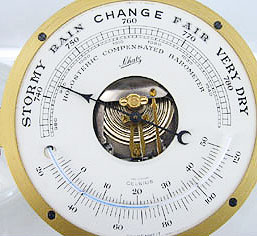
Despite the fact that rain is hard to predict, there seem to be exist a correspondance between the surface pressure and the weather conditions as shown in the picture below:
Data set#
The data we are going to use in this notebook comes from the ERA5 data base. To quote ECMWF: Reanalysis combines model data with observations from across the world into a globally complete and consistent dataset using the laws of physics. In the ERA5 data base, we can find 4d fields (time, latitude, longitude, height) such as temperature, wind, humidity, clouds, precipitation, etc… The time resolution is 1 hour, horizontal grid spacing is approx 20 km and vertical resolution varies with high resolution near the ground and coarse resolution near the top of the atmosphere.
To illustrate this notebook, I prepared a data set with surface variables only at a given location between 2000 and 2009 at the hourly resolution.
The variables in this data set are the raw variables that you can find in the ERA reanalysis
Variable name |
Description |
Unit |
|---|---|---|
t2m |
Air temperature at 2 m above the ground |
[K] |
d2m |
Dew point at 2 m above the ground |
[K] |
u10 |
Zonal wind component at 10 m |
[m/s] |
v10 |
Meridional wind component at 10 m |
[m/s] |
skt |
Skin temperature |
[K] |
tcc |
Total cloud cover |
[0-1] |
sp |
Surface pressure |
[Pa] |
tp |
Total precipitation |
[m] |
ssrd |
Surface solar radiation (downwards) |
[J/m^2] |
blh |
Boundary layer height |
[m] |
import numpy as np
import matplotlib.pyplot as plt
import pandas as pd
df = pd.read_csv("data/era5_paris_sf_2000_2009.csv", index_col='time', parse_dates=True)
df.describe()
| skt | u10 | v10 | t2m | d2m | tcc | sp | tp | ssrd | blh | |
|---|---|---|---|---|---|---|---|---|---|---|
| count | 87672.000000 | 87672.000000 | 87672.000000 | 87672.000000 | 87672.000000 | 87672.000000 | 87672.000000 | 87672.000000 | 8.767200e+04 | 87672.000000 |
| mean | 283.811469 | 1.063173 | 0.542577 | 284.102522 | 280.603131 | 0.674363 | 100306.215302 | 0.000081 | 4.692709e+05 | 592.633676 |
| std | 7.282320 | 2.920556 | 3.055488 | 6.615780 | 5.536824 | 0.356627 | 946.710936 | 0.000285 | 7.169155e+05 | 436.894806 |
| min | 258.046500 | -8.554123 | -8.692932 | 260.682980 | 258.580700 | 0.000000 | 95585.560000 | 0.000000 | -1.429965e-03 | 10.763875 |
| 25% | 278.694565 | -1.201481 | -1.761349 | 279.443792 | 276.807730 | 0.383133 | 99755.795000 | 0.000000 | 0.000000e+00 | 215.325750 |
| 50% | 283.566100 | 1.155563 | 0.384865 | 284.094120 | 281.082300 | 0.835373 | 100369.515000 | 0.000000 | 2.118400e+04 | 505.917295 |
| 75% | 288.581330 | 3.045872 | 2.631916 | 288.708078 | 284.839027 | 0.996002 | 100914.701250 | 0.000000 | 7.436800e+05 | 898.669800 |
| max | 313.901800 | 14.185852 | 14.439499 | 309.334100 | 296.104550 | 1.000000 | 102814.060000 | 0.005638 | 3.233472e+06 | 2987.135000 |
Take a moment to explore this data set. In this tutorial, we will be interested in the precipitation variable tp, the surface pressure sp, and the air temperature near the surface t2m. You can plot time series of these variables for the entire data set or for limited periods of time.
Remember that you can use the index df.index to select part of the dataset: e.g. df.index.year == 2000 or df.index >= '2000-01-01'.
For more advanced users, you can compute the seasonal cycle with .groupby(df.index.month).mean()
# Explore the data set here.
# You can add more cells if needed.
Question (optional)
Which variables hexhibit a seasonal cycle? a daily cycle? Could you have anticipated this result?
# your code here
Can you build a new normalized data set called df_norm. You can simply achieve this by subtracting the mean and dividing by the standard deviation.
# your code here
#df_norm =
In the same figure, plot a time series of the total precipitation tp and surface pressure sp. You can plot this time series for a month in winter and a month in summer.
Question
Do you observe any correlation between rain and pressure?
# your code here
As you can see (if you zoom enough), rain is very noisy data set. Indeed, if you observe the rain pattern, it is often very localized. This is also the reason why it is very hard to predict. In order to smooth the data, we are going to work with daily averages. Use the .resample method to to get daily averages.
# your code here
#df_day =
Let’s classify the days into two classes: “Rain”, “Dry”. Because we use normalized data, the amount of precipitation of dry days is not zero but is close to \(-0.2\). We use this value which corresponds roughly to \(0.5\) mm/day.
# normalized threshold (corresponds to 0.5 mm/day)
#precip_th = -0.2
#df_rain['tag'] = df_rain['tp'].where(df_rain['tp']> precip_th, 0)
#df_rain['tag'] = df_rain['tag'].where(df_rain['tp']<= precip_th, 1)
Use the function plt.scatter to plot a scatter plot of rain classification in the (pressure, temperature) space (sp, t2m). You need to adjust the color of the points so that we can see which category they belong to. Don’t forget to add labels to your plot.
# your code here
#plt.scatter()
Use the .boxplot to plot the percentiles of the pressure distribution for the rainy days and dry days. Keywords that could be useful here are column, by and if you feel like it patch_artist = True
# your code here
Let’s split our dataset into a training set and a testing set. For this tutorial, we will only keep surface pressure sp as our input feature. Uncomment the lines below to generate the training and testing data sets.
#from sklearn.model_selection import train_test_split
#X_train, X_test, y_train, y_test = train_test_split(df_day[['sp']],df_day['tag'],test_size=.3,random_state=0)
For now on, we will train our model an X_train and y_train. Later on, we will validate our results with X_test and y_test.
What is the number of day in each class?
What is the probability of having a rainy day in this data set?
# your code here
In order to compute the linear discriminant analysis, we need to compute the mean and covariance matrix of each class
What is the mean of each class? (Use the method
.groupby(y_train))
#your code here
What is the covariance matrix of each class? (Same hint)
#your code here
What is the weighted sum of the two covariance matrices
# your code here
Suppose rain is only function of pressure.
Compute the numerical coefficients of the two discriminant functions \(\delta_k(x) = x\frac{\mu_k}{\sigma^2} - \frac{\mu_k^2}{2\sigma^2} + \log P_k\)
#your code here
What is the threshold pressure to discriminate between rainy days and dry days?
# your code here
(Optional)
Same question but in the 2d space (pressure, temperature)
Plot this decision boundary on top of your scatter plot
Let’s analyze the Linear discriminant analysis provided by scikit-learn
#from sklearn.discriminant_analysis import LinearDiscriminantAnalysis
#lda = LinearDiscriminantAnalysis()
#lda.fit(X_train,y_train)
What is the class prediction according to this Linear Discriminant Analysis?
# your code here
What is the overall accuracy of our predictor? You can use the classification_report function.
from sklearn.metrics import classification_report
# your code here
You can look more closely at the results with the confusion matrix
from sklearn.metrics import confusion_matrix
# your code here
Do you get a completely different confusion matrix with the test data than with the train data?
Questions
Do you feel you have built a good predictor?
What would be the score of a predictor that would predict rain every day? dry every day?
What about a completely random predictor?
What do you think of the picture of the barometer at the beginning of this tutorial?
Further reading#
Read about the ROC curve and try to use the scikit-learn module to plot it.
Does the Quadratic discriminant analysis performs better on this data set?
Credit#
Contributors include Bruno Deremble and Alexis Tantet.
